Extracting Styles
A rich toolbox for quickly extract and organize XAML styles.
Introduction
Styles are a basic construction block for UI components that allows configuring a set of common properties that we may want to apply to several views. They're very useful, but also, very hard to manage. With MFractor XAML Style toolset, which includes the Style Extraction Tool and the Matching Style Code Analysis, you can quickly create styles from existing views and identify ones which a existing style may apply.
How to Extract a style
The XAML Style extraction tool is presented as a Code Action in the XAML editor. The option becomes available to the context menu when the cursor is placed over any XAML element.
For example, considering you have the declaration of a Label with some properties set:
<Label
    HorizontalTextAlignment="Center"
    FontFamily="{StaticResource OpenSans}"
    FontSize="Large"
    Text="Welcome to MFractor Docs!" />
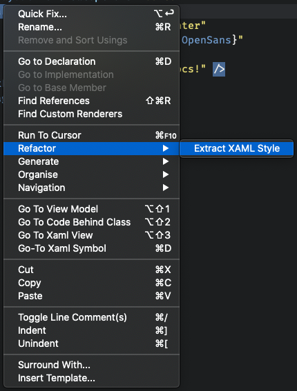
If you right-click on the Label declaration, the extraction tool will be available as option on the Refactor menu:
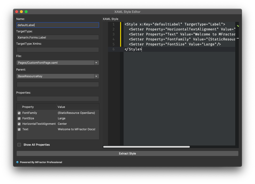
Selecting this option will present the XAML Style Editor dialog, that allows you to extract the properties currently set for the select element (or any additional properties you wish) into a new style, and substitute the properties declaration with the newly created style.
Configuring the Style Extraction
The extraction dialog offer several options to control how the extraction will be done.
Name
The name of the new style. This will be used as the key for the Resource Dictionary entry of the style declaration, and is the key to reference on the Style property of a XAML element.
TargetType
The TargetType is the .NET Fully Qualified Name of the type to which the new style is intended to be applied. In the example above, we are extracting a style from a Label component, which is a native Xamarin.Forms component represented by the Xamarin.Forms.Label type.
The value you set here will be used on the TargetType property of the style declaration in XAML, and defines the type of components to which the style can be applied. By default MFractor will fill in with the type from where you´ve invoked the Code Action, but you can change to any type you wish.
The more specific is the type you set as the Target of your style, the more properties of this type becomes available to the setters of the style, but you can also create more generic styles by referencing a common ancestor of the XAML elements, like View or VisualElement. A style with one of those target types may be applied both to a Button or a Label, as to any component that derives from those base classes.
Target Type Xmlns
This is a second field related to the Target Type declaration. This one is used when you're extracting a style that you may wish to apply to non-standard Xamarin.Forms components, such as custom XAML Views or Third-Party components.
Here you specify the single name of the XML namespace you want to declare to reference the type. Adding this information will impact how the Target Type field is rendered on the code of the new style. For example, if you set this field views, the output code will be:
<Style x:Key="[styleName]"
    TargetType="views:Label">
    <!-- The rest of the style declaration -->
</Style>
File
The File field is a drop-down that you can select where to add the new style that will be created. Defaults to the current XAML from where you've invoked the code action, but you can also add the style to the App.xaml file of the project (if exists) and make the new style shared among the whole application.
Parent
The XAML Styles framework allows the creation of a hierarchy of styles, much like you can do with Cascading Style Sheets (CSS, which are also available to Xamarin.Forms components but currently not supported by the MFractor tooling). This means that you can create more generic styles that can be used as the base or template of a new style.
When you create a hierarchy of styles, every property set on a parent style is propagated to the child ones, unless a property is explicitly overriden by being declared on this child.
Note
There are several ways of organizing styles into hierarchies but this topic is beyond the scope of this documentation.
Parenting also has implications on dynamic styles, that allows it to be dynamically changed during the runtime of the application, typically for applying different themes, such as light and dark variations of the app visuals.
The XAML Style Extraction tool allows you to specify the parent of the new style. There are two fields to this section:
- Parent Type: a drop-down that allows selecting between
BaseResourceKeyandBasedOnproperties to specify the parent resolution. - Resource Key: the text field below the parent type where you can type the resource key of the style that should be parent of this one.
Combined, this two fields controls how the declaration of the parent will be added to the new style that will be generated.
For a BaseResourceKey parent type, the output will be:
BaseResourceKey="[ParentResourceKey]"
For a BasedOn parent type, the output will be:
BasedOn="{StaticResource [ParentResourceKey]}"
If you leave the parent resource key field blank the parent declaration will be supressed.
Properties
The Properties section presents a grid that allows you to define which properties you want to include to the new style. MFractor will automatically load all the properties it find from the element declaration in the XAML. This tool allows you to:
- Check/Uncheck a single property entry to be added or excluded from the new style
- Change value of a property
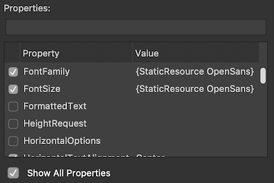
By clicking on the checkbox to Show All Properties, MFractor will load every property from the specified target type, allowing you to include properties that wasn't initially declared on the component from where you've invoked the code action:
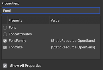
In the field above the list you can type for searching for specific properties:
This tool allow for fine-grained tuning of the new style you want to create and is a powerful editor to avoid having to type all the setters on the XAML style.
Previewing the new Style
The right pane of the Extraction dialog presents a preview of the style that will be generated, based on the properties previously set. This allows you to review your settings before executing the extraction.
The default snippet for the style generation is:
<Style
    x:Key="[styleName]"
    TargetType="[TargetType]"
    BaseResourceKey="[ParentResouceKey]"
    BasedOn="{StaticResource [ParentResourceKey]}">
  <Setter Property="[PropertyName]" Value="[PropertyValue]" />
  <!-- Repeats for each property set in the dialog... -->
</Style>
Notice that BaseResourceKey and BasedOn are mutually excludent based on the selection you make from the Parent options, like mentioned in the Parent section.
Extracting the Style
By clicking on the Extract Styles button the extraction will be processed accordingly to the options you've set.
The newly created style will be applied to the element where you have invoked the tool and all the properties selected to be included in the new style will be removed from its declaration.
Following on our previous example, if we create a new style with the name defaultLabel and include all the properties previously set to the component this is the end result:
<Label Style="{StaticResource defaultLabel}" />
Summary
The extraction XAML Style tool allows you to quickly extract common properties that you may want to set on several controls into a XAML Style. MFractor also provides the Matching Style Code Analysis that helps identify places where existing styles can be applied. Check its documentation for further details.