Grid Intellisense Commands
Quickly declare grids with its boilerplate code and manage its rows and columns declarations and child positioning
Introduction
MFractor introduces several intellisense commands to aid on writing Xamarin.Forms layouts using the Grid component. Those commands allows you to:
- Declare a new Grid element including its boilerplate code
- Declare Row or Column definitions for auto and star widht/height
- Declare the Row or Column or the Span of child elements of a grid
Using the Grid Intellisense Features
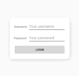
The Grid intellisense appears on the appropriate contexts when editing XAML files. On the next sections we will build a login form in an XAML Page using the Grid layout. This layout will have 3 rows and two columns, where the first column will have the labels and the second column the entries, and the third row will span among the columns to add the login button. The result will look as below:
Grid Boilerplate Code Completion
To start our login form we will declare a new Grid inside a Frame element in a ContentPage. The frame itself will be inside a root grid element. This allows to produce a login form that looks like a floating card on the screen. Start with the following XAML code for the page:
<ContentPage
    xmlns="http://xamarin.com/schemas/2014/forms"
    xmlns:x="http://schemas.microsoft.com/winfx/2009/xaml"
    x:Class="MFractor.Samples.Pages.GridSamplesPage">
    <Grid>
        <Frame>

        </Frame>
    </Grid>
</ContentPage>
Place the cursor inside the blank line on the Frame element (row number 7) and type an opening angle bracket (<) to declare a new XML element. The Intellisense suggestions will appear:
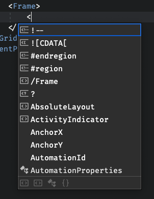
When the Intellisense suggestions is open you can start typing to filter what you need. Hit the G and r keys, and the suggestion for Grid (Boilerplate) should appear at the end of the list:
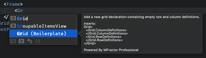
The intellisense tooltip provides a little preview of what will be generated to you. Select the option with either the cursor keys or the mouse and type Enter or Tab to apply the suggestion. The editor will add the declaration of a Grid with the boilerplate for declaring its Rows and Column definitions like the snippet below:
<Grid>
    <Grid.ColumnDefinitions>
    </Grid.ColumnDefinitions>
    <Grid.RowDefinitions>
    </Grid.RowDefinitions>
</Grid>
Grid Row and Column Shorthand Completions
Next we need to declare the Columns and Rows definitions of our grid. This tells the Xamarin.Forms Grid engine how it will apply the available space to it's children elements. Row and Column definitions declares their width or height based on one of the 3 unit types: Auto, Proportional (also know as star, declared with the * char) or Absolute.
Tip
For more information about the Grid Rows and Columns declaration see the Official Xamarin.Forms docs for the Grid.
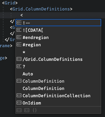
With the MFractor Intellisense completions for Grid you can quickly declare rows and columns definitions. First lets declare our Column Definitions. There will be two Columns, the first will by automatically sized and the second will be proportional. Start a new line on the Grid.ColumDefinitions element and typpe an opening angle bracket to start a new element declaration. Intellisense appears and you should immediatly see the * and Auto options available to the list:
Both are completions provided by MFractor. For the first column, select the Auto option and type Enter or Tab to apply the completion. MFractor will add a new ColumDefinition entry like below:
<ColumnDefinition Width="Auto" />
Repeat the steps to add a new proportional column definition by selecting the * option in the list. It will add the following definition:
<ColumnDefinition Width="*"/>
Note
You can still type to filter the options even when they already appear on the list. This would save some keystrokes or having to move the mouse to the wanted element.
Next repeat the same process to add 3 new Row Definitions, all of the proportional height. The end result of your grid definition should be as follows:
<Grid>
    <Grid.ColumnDefinitions>
        <ColumnDefinition Width="Auto"/>
        <ColumnDefinition Width="*"/>
    </Grid.ColumnDefinitions>
    <Grid.RowDefinitions>
        <RowDefinition Height="*"/>
        <RowDefinition Height="*"/>
        <RowDefinition Height="*"/>
    </Grid.RowDefinitions>
</Grid>
Grid Row and Column Location Completions
The last step for our login form is to declare its containing elements. We will declare two Label elements, two Entry elements and a Button element. We'll be using the MFractor intellisense grid location suggestion to easily define where our elements should be put in the available rows and columns of the grid.
First, let's declare the labels. Inside the Grid we declared before add a new Label declaration. When you hit space to start adding attributes to the element, intellisense will list suggested properties of the label. Type G then r to filter the list and you should see the suggestions for the available columns and rows of the Grid:
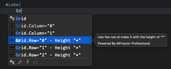
Those are the suggestions provided by the MFractor Grid Intellisense location feature. Notice that when you select a suggestion and wait a second a tooltip appears showing details about the width or height of the column or row in question.
Important
The grid location intellisense completion only appears for Grid elements that declares rows or columns definitions. A plain Grid element will not suggest any completion, because MFractor is unable to infer how may rows and columns the grid may contain. If you don't find those suggestions check the rows and columns definitions.
For this first label we want to add it to the first row and the first column of the grid, so use the completions to quickly add the attached properties to the label. Its final declaration should be like below:
<Label
    Grid.Column="0"
    Grid.Row="0"
    VerticalOptions="Center"
    Text="Username" />
Repeat the steps to create a new label, but change the Grid.Row property to 1 and the Text property to Password. Next add the declarations for the Entry elements, the code rest of the code for this part of the form is as follows:
<Label
    Grid.Column="0"
    Grid.Row="1"
    VerticalOptions="Center"
    Text="Password" />

<Entry
    Grid.Column="1"
    Grid.Row="0"
    Placeholder="Your username" />

<Entry
    Grid.Column="1"
    Grid.Row="1"
    IsPassword="True"
    Placeholder="Your password" />
Use the IntelliSense completions to easily fill the row and column information of each element.
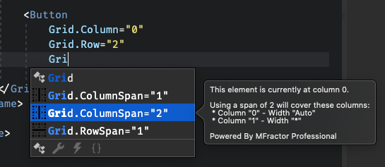
Grid Row and Column Span Completions
The last part is to add the login button. It will take the entire third row of the grid, so we should add a column span to allow it use the entire width of the grid. First you should add the declaration of the button adding its row and column locations. As in the preview iterations, hit a new line to add a new attribute for the column span and start typing G and r, the suggestions for either column and row span should appear wiht intellisense:
The final button declaration should be as follow:
<Button
    Grid.Column="0"
    Grid.Row="2"
    Grid.ColumnSpan="2"
    Text="Login" />
Note
For the span completions to appear you should declare both the Grid.Row and Grid.Column for that element, so MFractor can calculate the available span options for each direction.
Summary
On this tutorial document we've checked how to use the MFractor Grid Intellisense features to quickly produce a new Grid layout for a login forms in Xamarin.Forms. The complete source code for this tutorial is available at GitHub on our samples repository. Check the official Grid documentation on the Xamarin.Forms docs for further information about how to use the Grid layout component.